Appearance
Statistics Page
What is the Statistics Page?
The Statistics page in TerraFuse gives managers a clear picture of how charging stations are being used.
Think of it as a dashboard that shows usage, energy, downtime, money earned, and charging time.
It helps you answer simple questions like:
- How often are the stations being used?
- How much electricity is being consumed?
- When are stations sitting idle?
- How much revenue is being generated?
- What are the busiest months?
Navigation
- Go to the sidebar and click Statistics (it will be highlighted in green when selected).
- By default, you’ll see usage data for one charging station.
- The chart shows data by months (e.g. January–August 2025) or total for the selected time period.
Main Controls
- Export – Download the data as a file.
- Reset Filters – Clear your selections and go back to the default view.
- Months / Total – Switch between seeing data month-by-month or as a total.
- Refresh – Updates the chart with the latest information.
The Five Views
At the top of the page, you can switch between five different types of data:
1. Consumption (kWh)
Shows the total electricity used for charging (measured in kilowatt-hours) shown in Figure 4.5.1.
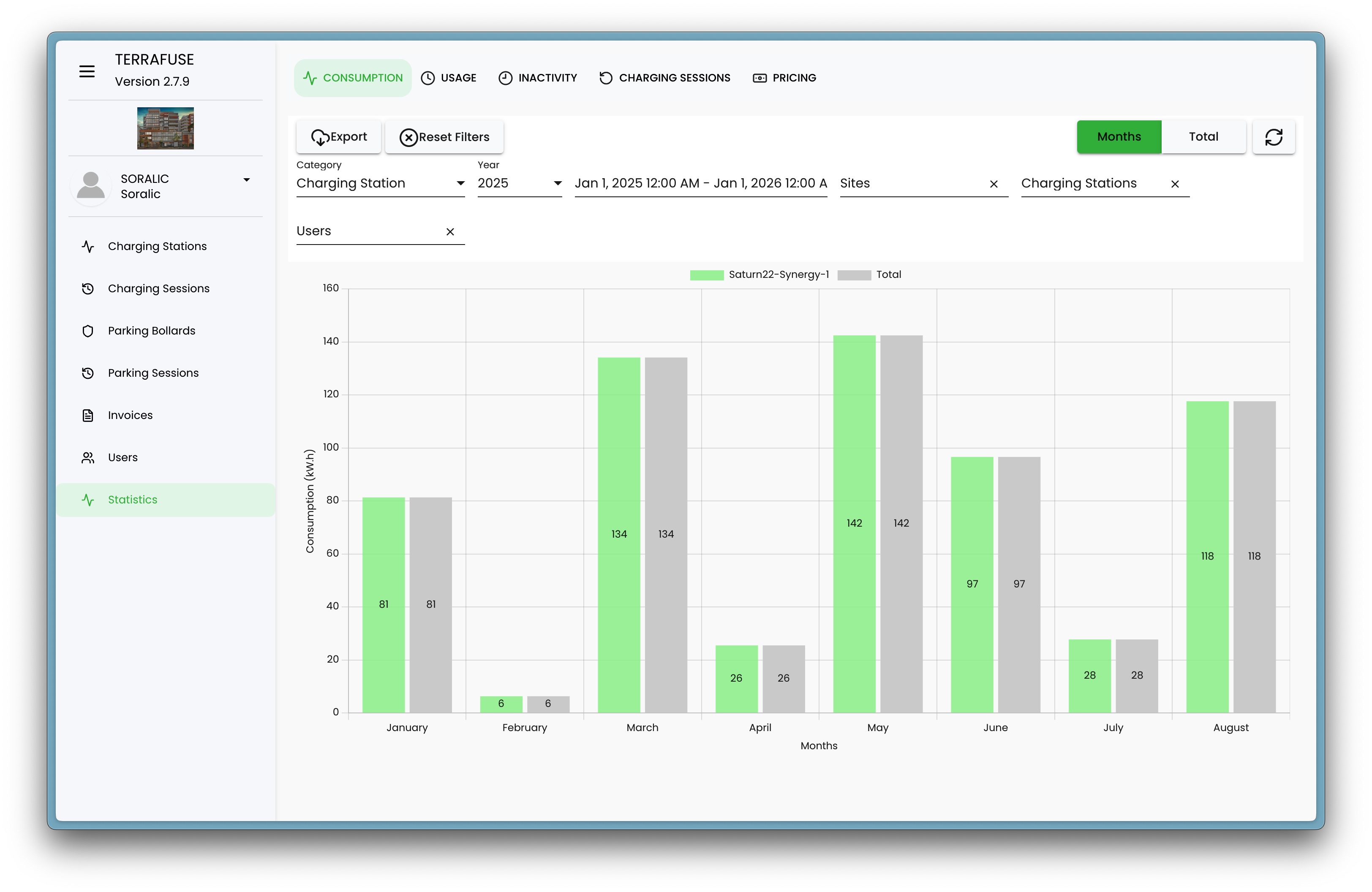
- High values mean cars needed more charging (either longer sessions or bigger batteries).
- Useful for understanding electricity demand and predicting costs.
2. Usage (hours) ⏱
Shows the total hours cars were actively charging, shown in Figure 4.5.2.
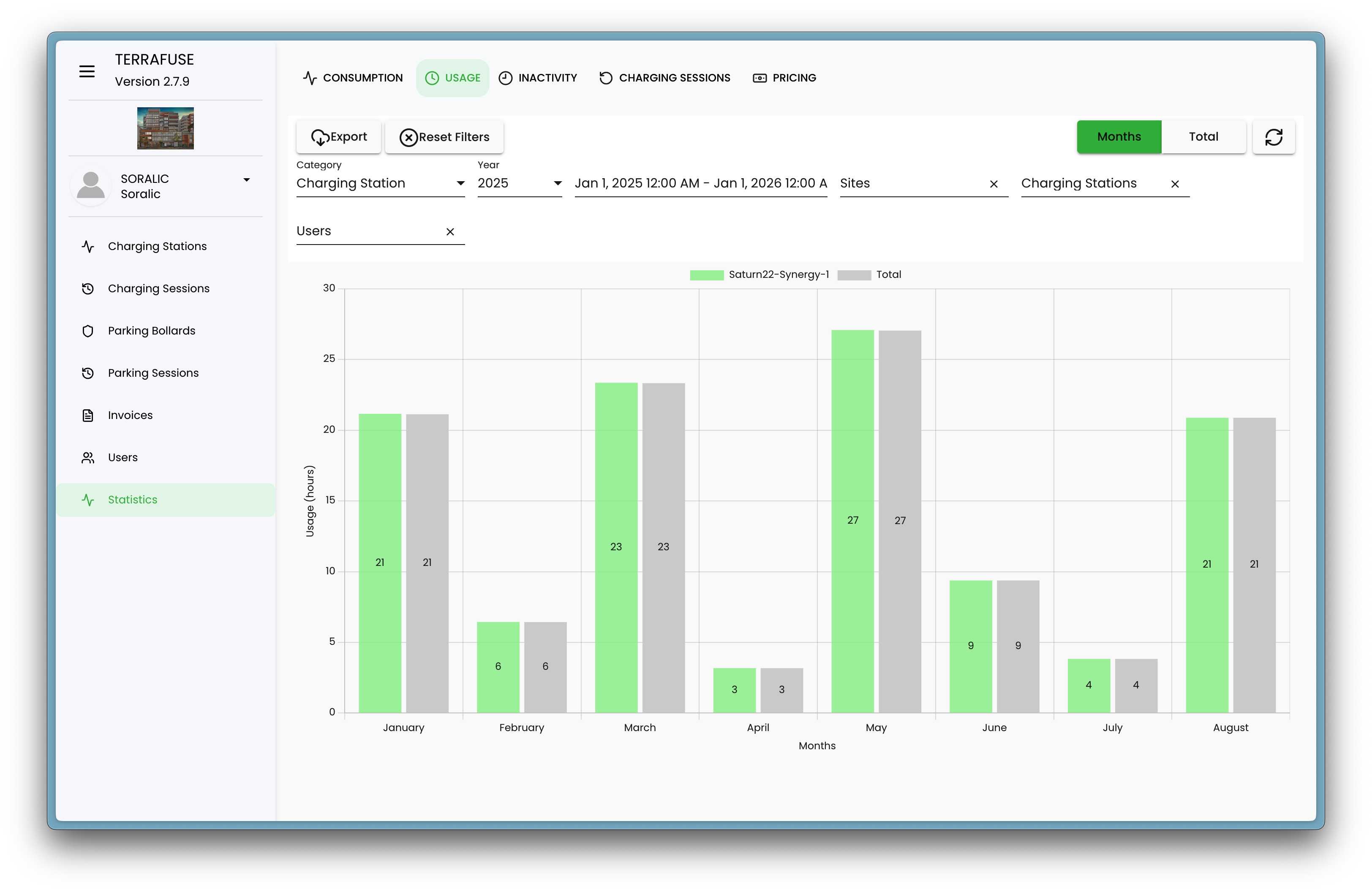
- High usage = station is in demand.
- Helps you measure efficiency and plan for more capacity if needed.
3. Inactivity (hours)
Shows how many hours the station was not being used, shown in Figure 4.5.3.
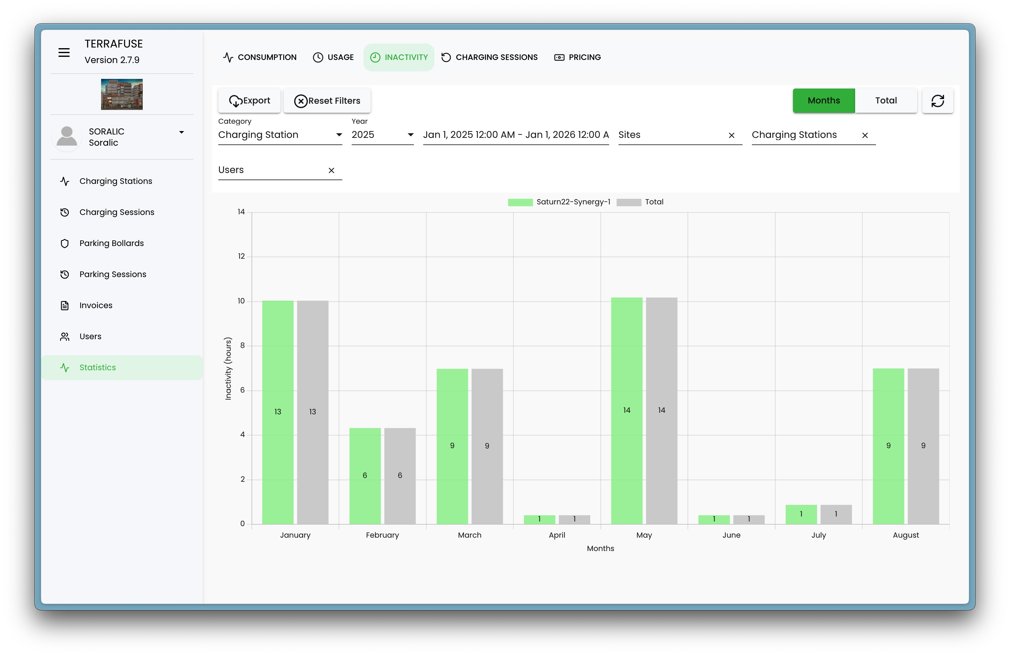
- High inactivity = station was sitting idle.
- Helps with planning maintenance or spotting underused stations.
4. Charging Sessions
Shows how many times cars were plugged in to charge, shown in Figure 4.5.4.
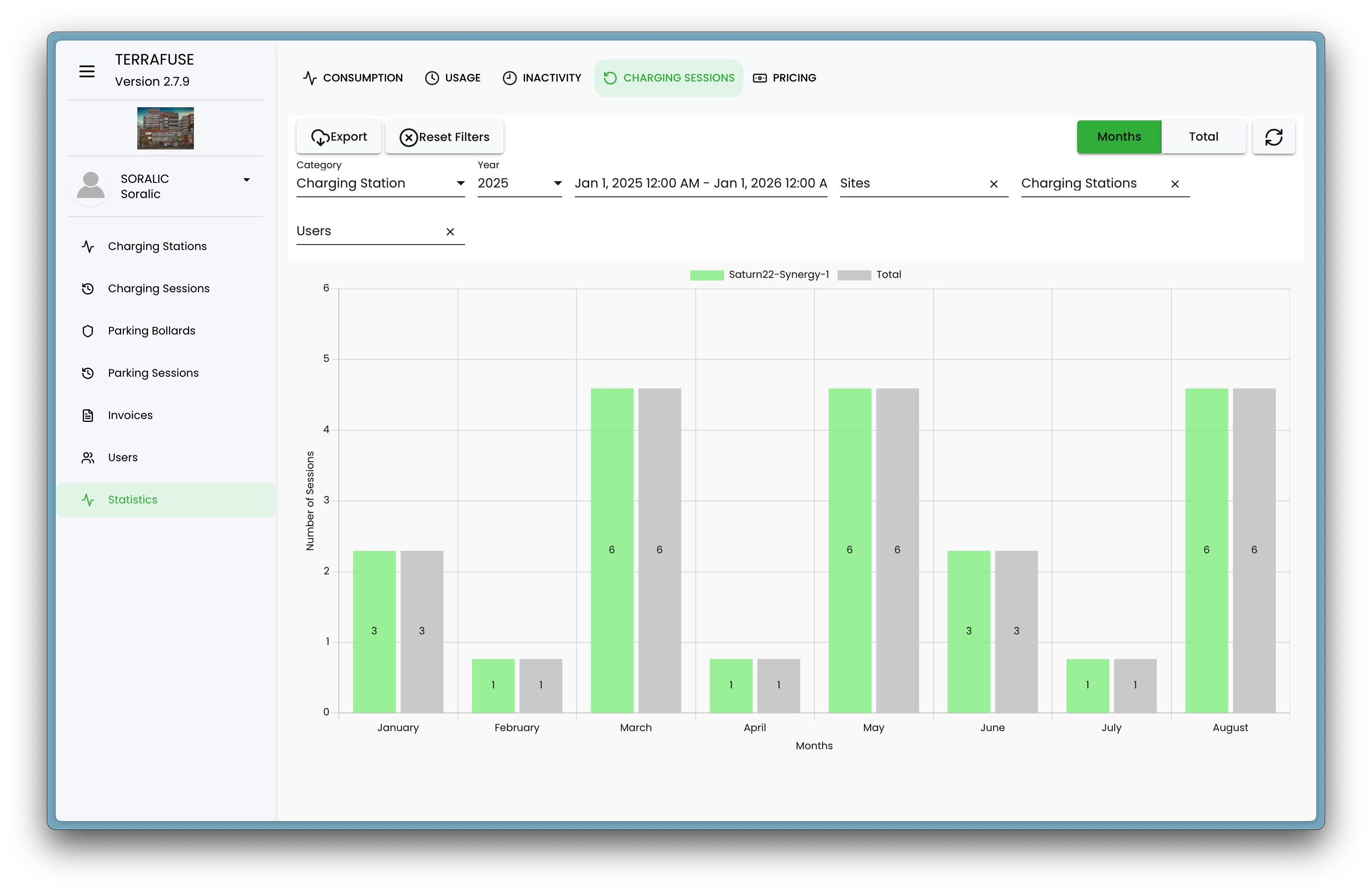
- Green bars = selected station
- Gray bars = all stations combined
- Taller bars mean more charging sessions that month.
This helps you see which months were busiest or quietest.
5. Pricing (Revenue)
Shows the money earned from charging sessions, in Figure 4.5.5.

- Helpful to track income each month.
- You can easily see which months were more profitable.
How to Read the Charts
- Green bars – Your selected charging station.
- Gray bars – Total across all stations (for comparison).
- Numbers on bars – Exact values (e.g., number of sessions or hours).
- X-axis – Months of the year.
- Y-axis – The measurement (hours, kWh, sessions, or dollars).
👉 Taller bars mean more activity. Comparing green and gray bars helps you see how one station performs against the network.
Filters
You can refine what you see using filters:
- Date range – Choose which months or years to review.
- Charging Station – Select a specific station or all stations.
- Users – Focus on activity from specific residents or groups.
This makes it easy to zoom in on the data that matters most.